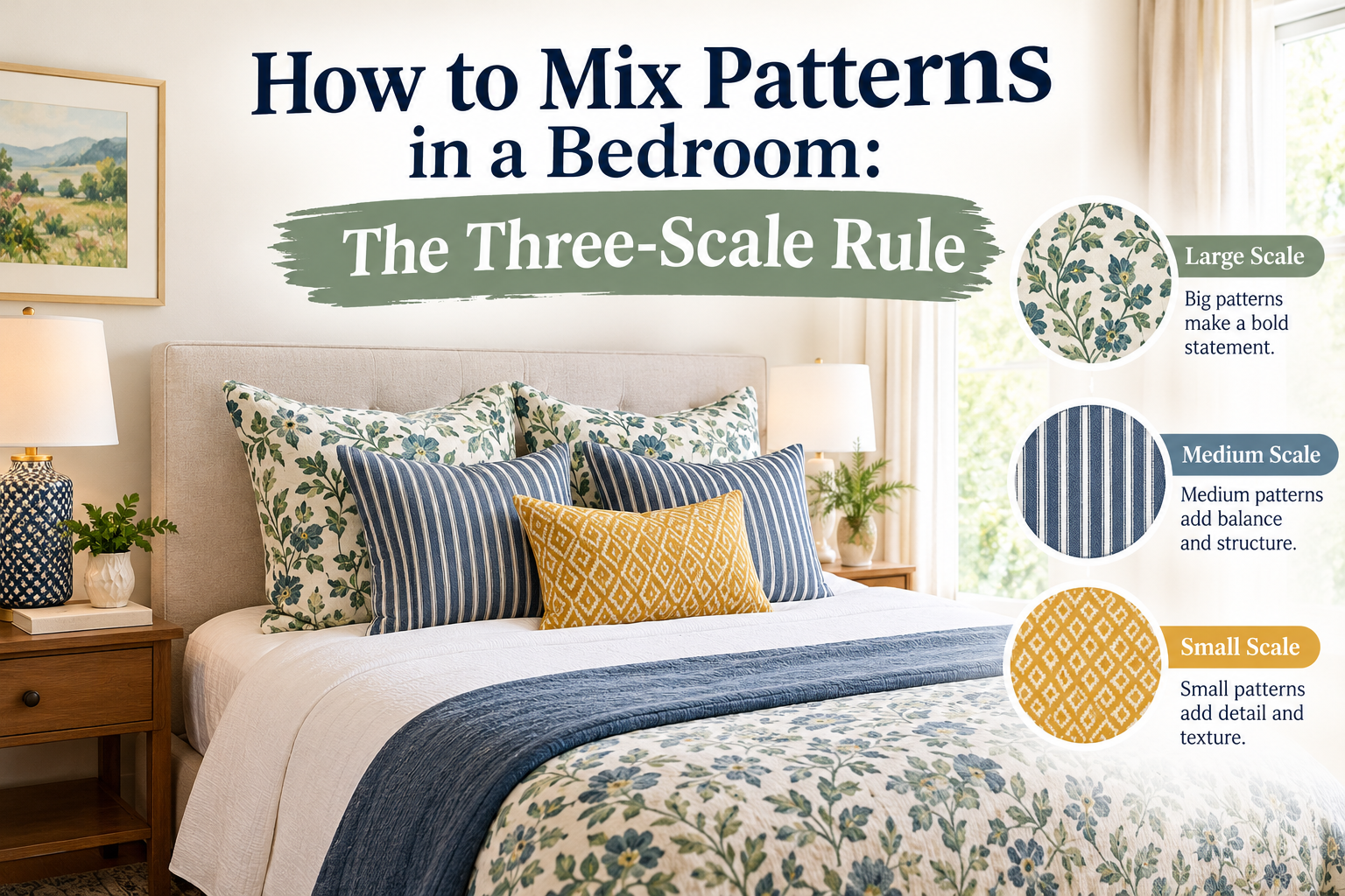
- Choose one large print, one medium print and one small print or geometric.
- Make every print share at least one colour.
- Balance patterns with solids, roughly one plain surface for every patterned one.
- Spread pattern around the room, not just on the bed.
Mixing patterns is the quickest way to make a bedroom feel personal, layered and full of character. It is also the part of decorating that makes people most nervous. The good news is that knowing how to mix patterns is less about taste and more about a few reliable rules: vary the scale, share a colour palette and leave room for the eye to rest. This guide explains each rule, walks you through layering a bed step by step, and gives you tested pattern combinations you can copy.
Why mixed patterns work (and when they fail)
A room with no pattern can feel flat, while a room with too many competing prints feels chaotic. Mixed patterns succeed when the eye can move easily from one to the next. That happens when the prints are different sizes, so they are not fighting for attention, and when they are linked by colour, so they read as one family. Most pattern-mixing mistakes come from breaking one of those two conditions: several prints the same size, or prints chosen from unrelated colour schemes.
Step 1: Choose an anchor print
Start with the piece you love most. In a bedroom this is usually the duvet cover, quilt or bedspread, because it covers the largest area and sets the tone for the room. Make it your largest-scale pattern: a bold floral, a tree of life, a medallion, a large paisley or a wide block print.
Everything else in the room will take its cue from this one piece, so choose it carefully. If you love a print but are unsure, live with it for a few days on the bed before buying the supporting pieces.
Step 2: Pull a palette from your anchor
Look closely at the anchor and name three colours: a dominant ground colour, a secondary colour and a small accent. Your other prints and solids will use these same colours in different proportions.
A useful guide is the 60-30-10 rule. About 60% of the room's colour comes from the dominant shade, 30% from the secondary shade and 10% from the accent. For example, a quilt with an indigo ground, rust flowers and mustard centres might lead to indigo-dominant bedding, rust cushions and curtains, and touches of mustard in a throw and a lamp base.
Step 3: Vary the scale
Scale is the most important rule in pattern mixing. Two prints of the same size compete for attention. A large print next to a medium print next to a small print creates a natural hierarchy that the eye can follow.
| Layer | Scale | Bedroom example |
|---|---|---|
| Anchor | Large | Floral duvet cover, quilt or bedspread |
| Support | Medium | Paisley euro shams or curtains |
| Accent | Small | Striped, dotted or checked cushions, a bed skirt |
| Rest | Solid | Plain sheets, a linen throw, the walls |
To judge scale, stand back about two metres. A large print still shows clear individual motifs from that distance; a small print starts to read almost as a texture.
Step 4: Mix pattern types
Beyond size, vary the type of pattern. Most successful bedrooms combine three families:
- Organic patterns such as florals, paisleys, vines and leaves.
- Geometric patterns such as stripes, checks, grids, diamonds and dots.
- Textural patterns such as kantha stitching, slub weaves, quilting and chunky knits, which add interest without strong colour.
A floral paired with a stripe is one of the easiest combinations to get right, because the straight lines calm the curves. Kantha quilts are especially useful here: their running-stitch texture reads as pattern but rarely competes. Our guide to kantha quilts explains how they are made.
Step 5: Give patterns room to breathe
Patterns need plain surfaces around them. Solid sheets, a calm wall colour, an upholstered headboard in a plain fabric or a simple rug give the eye a pause. If a room feels busy, the fix is rarely removing a print; it is usually adding a solid.
A good balance is roughly one solid surface for every patterned one. On the bed, that might be solid sheets and pillowcases under a patterned duvet, with a solid throw folded at the foot.
Step 6: Spread patterns around the room
Do not concentrate every print on the bed. Repeat the medium or small pattern elsewhere, in curtains, a lampshade, an armchair cushion or a rug. This ties the room together and stops the bed feeling like an island. A simple test is to look at the room from the doorway: pattern and colour should appear on at least three sides of the room.
How to layer a bed with mixed patterns
Here is a layering order that works for almost any style.
- Fitted and flat sheets: solid, or a very small print, in your dominant or a neutral colour.
- Duvet cover or quilt: your large anchor print.
- Coverlet or folded quilt: a smaller print or textured solid folded across the lower third of the bed.
- Sleeping pillows: solid pillowcases matching the sheets.
- Shams or euro shams: your medium print, standing behind the sleeping pillows.
- Decorative cushions: one or two small prints or stripes, plus one solid in your accent colour.
- Throw: a solid or textured throw in the accent colour, draped casually.
Odd numbers of cushions, such as three or five, usually look more relaxed than even numbers.
Five pattern combinations you can copy
| Style | Large | Medium | Small | Solids |
|---|---|---|---|---|
| Classic indigo | Indigo floral quilt | Blue and white paisley shams | Ticking stripe cushion | White sheets, natural linen throw |
| Warm bohemian | Rust and mustard medallion | Kantha quilt in coral | Small dot cushion | Terracotta throw, cream sheets |
| Soft romantic | Blush rose floral | Sage green vine print | Gingham cushion | Ivory sheets, sage throw |
| Garden fresh | Green tree of life | Yellow small floral | Green and white stripe | White sheets, olive throw |
| Modern global | Black and white block print | Ochre geometric | Fine grid cushion | Grey sheets, ochre throw |
Pattern mixing by decorating style
Bohemian
Boho bedrooms can handle more pattern than most. Use warm earth tones, mix global prints like paisley and block print florals, and add texture through kantha, macramé and rattan. See our boho ideas for keeping it calm rather than cluttered.
Traditional
Stick to classic pairings: florals with stripes and checks in two or three colours. Matching curtains and shams in one print can look polished here.
Coastal
Blue and white is almost foolproof. Combine a large indigo print with ticking stripes and plenty of white.
Modern
Use fewer prints, perhaps just two, in a restrained palette, and rely on texture for depth.
How to shop for mixed patterns
Buying prints one at a time from different shops is where most combinations go wrong. A few habits make it much easier.
- Buy the anchor first. Never buy supporting cushions or curtains before you have the main piece in your hands.
- Carry a reference. Take a photo of the anchor in daylight, or a small fabric swatch, when you shop for the rest.
- Check colours in natural light. Shop lighting and screens shift colours; a rust can look red and an indigo can look black.
- Look within one collection. Many makers design prints to work together. Choosing a large, medium and small print from one collection is a shortcut to a pairing that works.
- Order swatches for big pieces. For curtains or a large quilt, a sample saves an expensive mistake.
Mixing patterns in a small bedroom
In a small room, keep the palette tight, two colours plus a neutral, and choose prints with plenty of background showing. Use pattern at bed height and below, keeping walls light. A single patterned curtain on a light fabric, like those in our guide to choosing sheer curtains, adds pattern without closing the room in.
Common pattern mixing mistakes
- Every print the same size. They compete; vary the scale.
- No shared colour. Prints from different palettes look accidental.
- Three large prints together. One large print per room is plenty.
- Matching everything exactly. A full matching set reads as a catalogue rather than a room with character.
- Forgetting solids. Without plain surfaces, even well-chosen prints feel busy.
Quick pattern-mixing checklist
- One large anchor print chosen and placed.
- Three-colour palette named from the anchor.
- One medium and one small print, both using palette colours.
- At least one geometric among the prints.
- Solid sheets or a solid wall for balance.
- Pattern repeated on another side of the room.
Curious about what the motifs on your bedding mean? Read about paisley meaning and elephant symbolism.
Frequently asked questions
How many patterns are too many in a bedroom?
Three patterns is a comfortable number for most rooms. Confident decorators use four or five, but only with a tight shared palette and plenty of solids.
Can you mix florals and stripes?
Yes. A stripe is one of the easiest partners for a floral, as long as the two share at least one colour.
Should bedding and curtains match?
They should relate rather than match. Repeat one colour from the bedding, or use a smaller print from the same colour family.
What is the rule of three in pattern mixing?
Use three patterns in three different scales: one large, one medium and one small, all linked by a shared colour.
How do I mix patterns without it looking busy?
Vary the scale, keep to a three-colour palette and include roughly one solid surface for every patterned one.